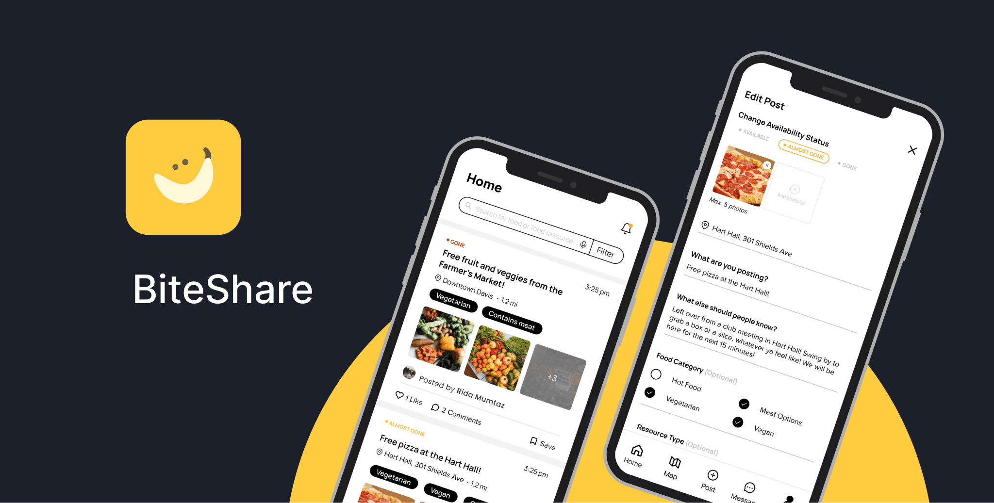
BiteShare
Improving resources to reduce wastage & share food to a larger community. BiteShare is a community-based food sharing platform that leverages technology to reroute excess food to where it can be eaten instead of wasted.
UX Research, UI

Project Overview
Client: Independent UX Project
Team: Myself, Samiksha Rathore (Engineer)
Timeline: Jul - Sept 2025
My Role: Lead UI/UX Designer
Reading Time: 7 minutes
Overview
BiteShare is a community-based food sharing platform that leverages technology to reroute excess food to where it can be eaten instead of wasted. It makes it possible for folks to discover free food and share surplus food wherever they are and builds an inclusive, cooperative, and local food ecosystem among neighbors, local restaurants, and non-profits.
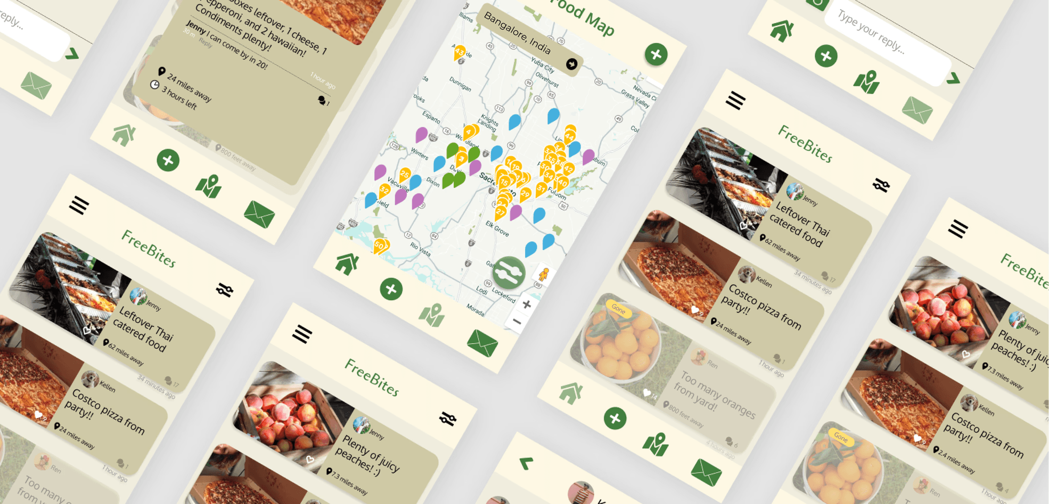
It's a redesign! BiteShare was a project developed back in sophomore year of our college. Being engineered, it is redesign to optimized for all user types. BiteShare also wants to shift from a campus-based platform to a community-focused one. Below is a comparison between the BiteShare app before and after our redesign
Research
I fleshed out the UX research plan, which included a competitive audit and user interviews with usability testing.
Our main research goals were to understand the food sharing process and identify the different types of users that might use the app and their pain points, goals, and needs.
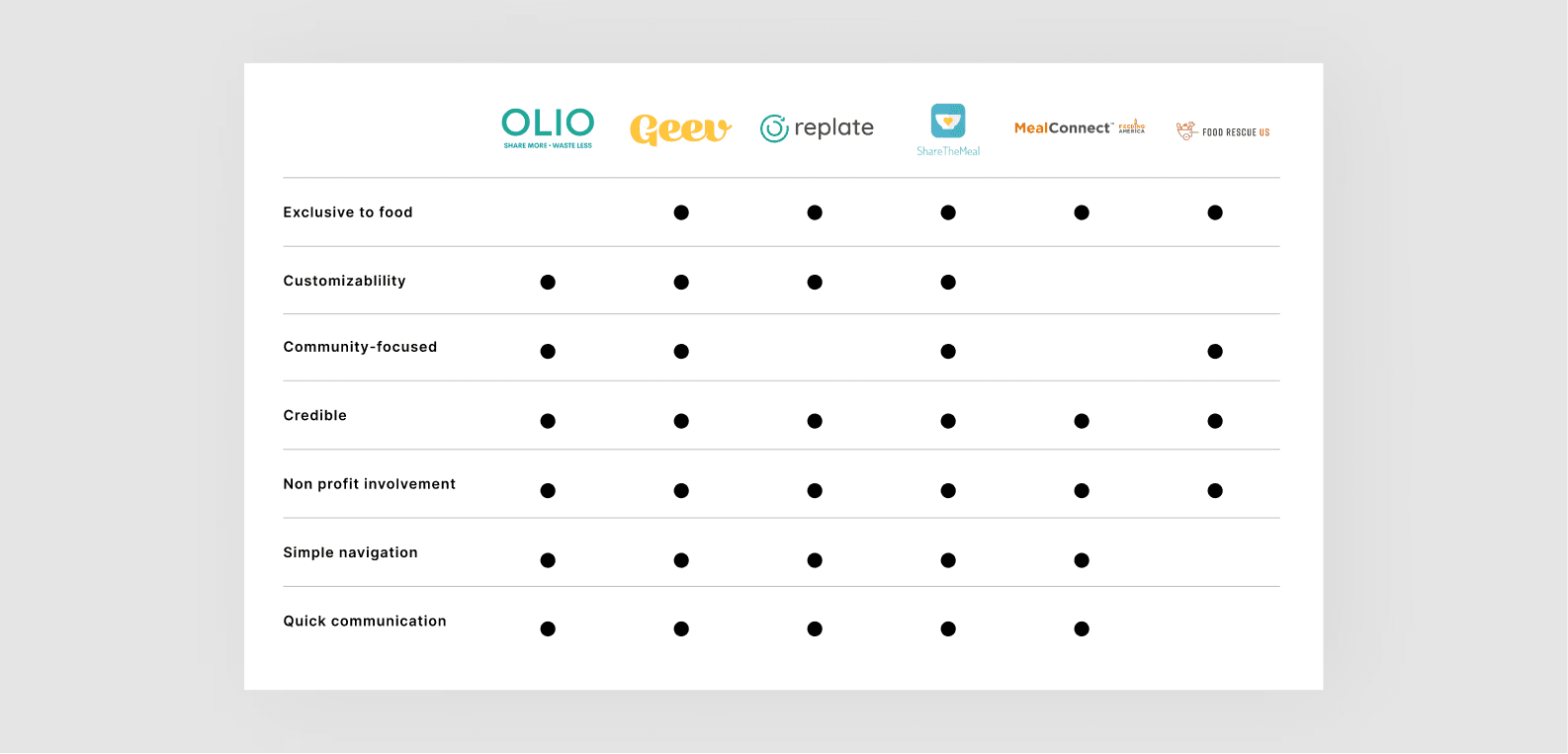
Competitive Audit
I conducted a competitive audit to familiarize ourselves with the food sharing process. There exists very few national counterparts in India, but a few International apps we focused on. There exist multiple ways in which these competitors provide a better user experience than BiteShare:
1. More customizability and control to users
2. Ability to see live food availability updates
3. Clear linking between pages
4. Connects people with free food opportunities quickly and efficiently
5. Builds higher credibility between food sharers and seekers
A week of user interviews
We conducted a total of 6 interviews with active users, consisting of students, educators, and community leaders. Those interviews were broken down into 2 parts:
Part 1: Questions to learn about their current user flows and overall app experience
Part 2: Light usability test of the current design to observe how they find or post about food surplus in the current ecosystem
The goal was to identify patterns and pain points in the current experience and discover how each user type can more efficiently and easily operate through their user flows.
Classifying User Types
We discovered BiteShare's 3 main user types:
1. Food insecure (surplus seeker)
2. Food secure (surplus sharer)
3. Non-profit
What we heard
It's a great idea. I wish It was useful for me more. I wish I was on campus, but I live outside."
— Student, Surplus Seeker
"The app can feel limiting, one photo could not provide an accurate visual of what was available."
— Community Leader, Surplus Sharer
"I felt bad when students came too late and the food was no longer there."
— Community Leader, Surplus Sharer
"I want to give people a set time for when food distribution begins."
— Community Leader, Non-profit
Research Synthesis
I collected a lot of data on our 3 user types and needed to streamline our findings and prioritize the main focus areas that aligned with the overall research goals.
Empathy Mapping
To highlight key research findings across all user types and aid in our decision-making, we utilized empathy mapping. This helped us make inferences about our users based on their behavior, prioritize where our focus laid, and determine what the most important takeaways were.
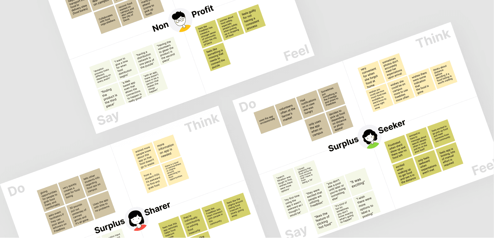
Top takeaways
While each user type had a variety of needs and pain points, across all user types, it was clear to us that the most important takeaways were:
1. Users only find themselves using the app on campus
2. Expectations are disconnected between each user type
3. Limited customizability and autonomy keeps people from engaging with the app
Illustrating experiences
I got some help with my teammate. We each diverged and created our own storyboards to visualize the full weight of the issues and present potential solutions that might solve them. We used Storyboarding.
Top Solutions
Storyboarding revealed that the main issues with the current experience were misaligned expectations and limited customizability/autonomy for all user types. At this stage, we were able to establish our top solutions for our redesign that would remedy these issues:
Real-time updates
Allowing surplus sharers to assign and change the food availability status on their post and notifying seekers of updates would help align expectations between them.
Post customization
Adding more options to allow for post customization would minimize frustration, anxiety, and confusion during food acquisition. It would also present more accurate search results.
Non-profit experience optimization
Building out a more comprehensive food map based on resource type would optimize the non-profit experience to increase their engagement. Because non-profits are more connected to members of the community, their engagement would expand BiteShare community usage beyond campus.
Social media model
Modeling our design layout and iconography after social media platforms like Instagram and Facebook, further asserts that sense of community that BiteShare is aiming for. Adding in a liking feature, comments section, and profile acts as encouragement and proof to other users that people in their community are also engaging with the app.
Low-fidelity concepts
I created low-fidelity concepts to generate as many unique ideas as possible and disregarded constraints to explore the most creative solutions. This was also an opportunity to visualize and decide on the most efficient user flows.
UI Refinement
We reviewed our low-fidelity concepts and were able to confirm development feasibility and approval of each of our solutions.
Building a moodboard
We put together a moodboard for inspiration before creating our own design system.

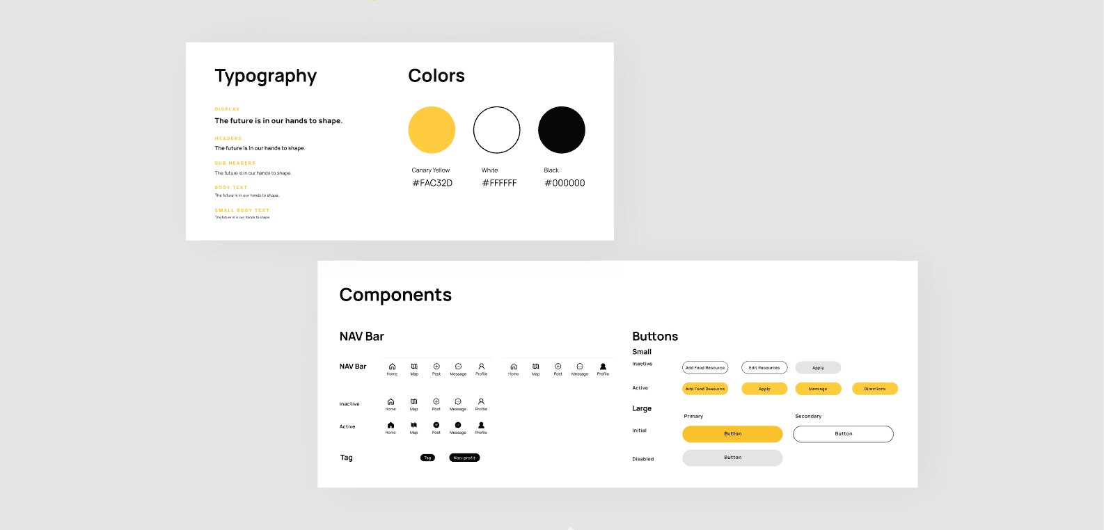
Establishing a design system
Once we felt we were in agreement with the visual feel, we decided on a design system to ensure consistency across all screens and ease the development process.
Part 1: Gathering feedback
I polished up the screens that would be used in user testing, and was able to identify the basic gaps in the flow


Final Designs
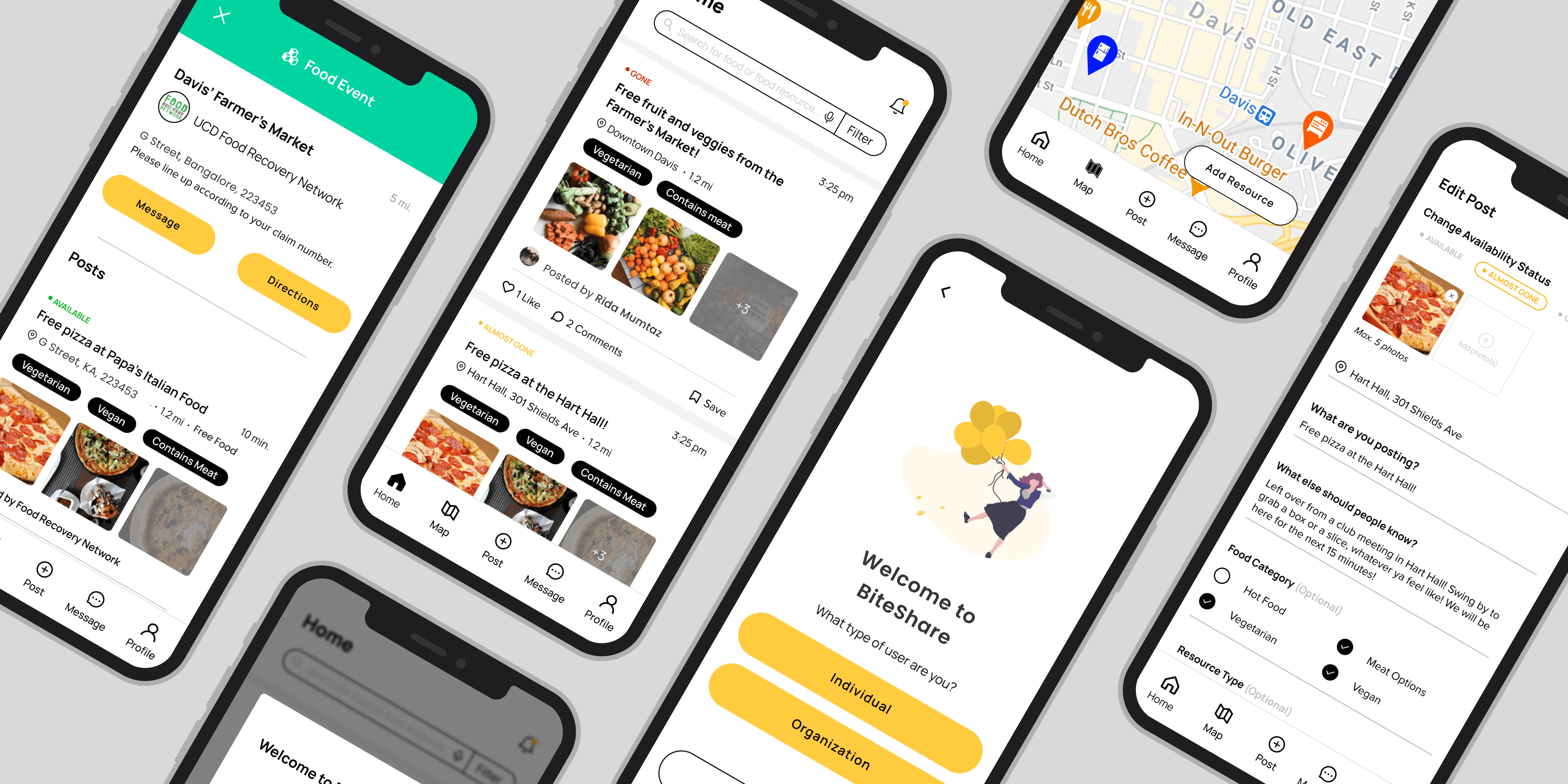
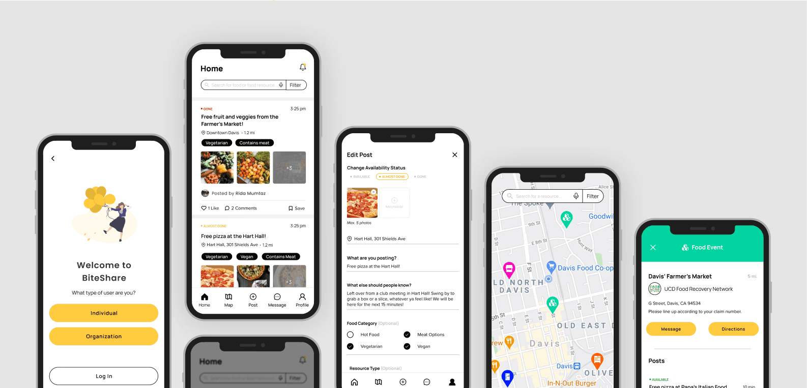
The images here demonstrate the features I designed. Each feature below was driven by research, user stories, feedback, and user testing.
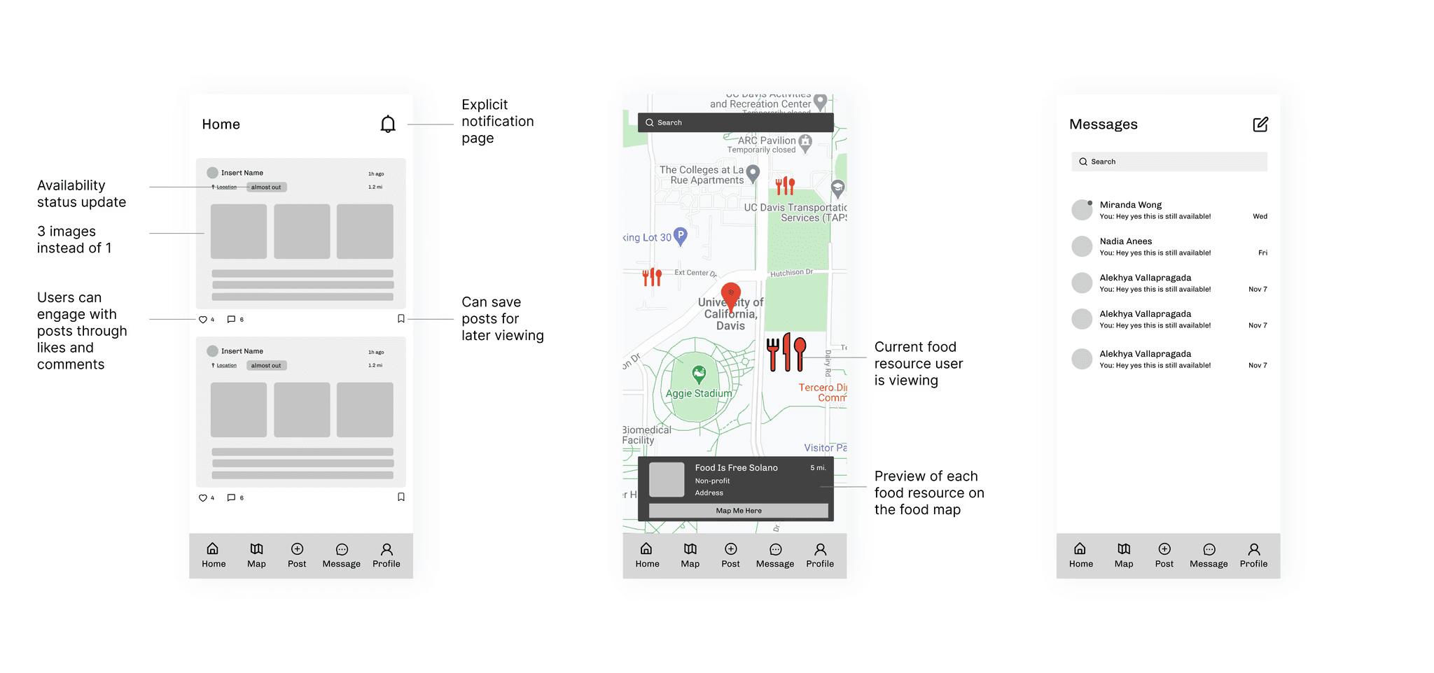
Onboarding Screens
After opening the app, new users a presented with a pop-up identifying the main actions they can take on the app. Upon closure, they can view the home feed with listings made nearby or search and filter for a more specific food opportunity.
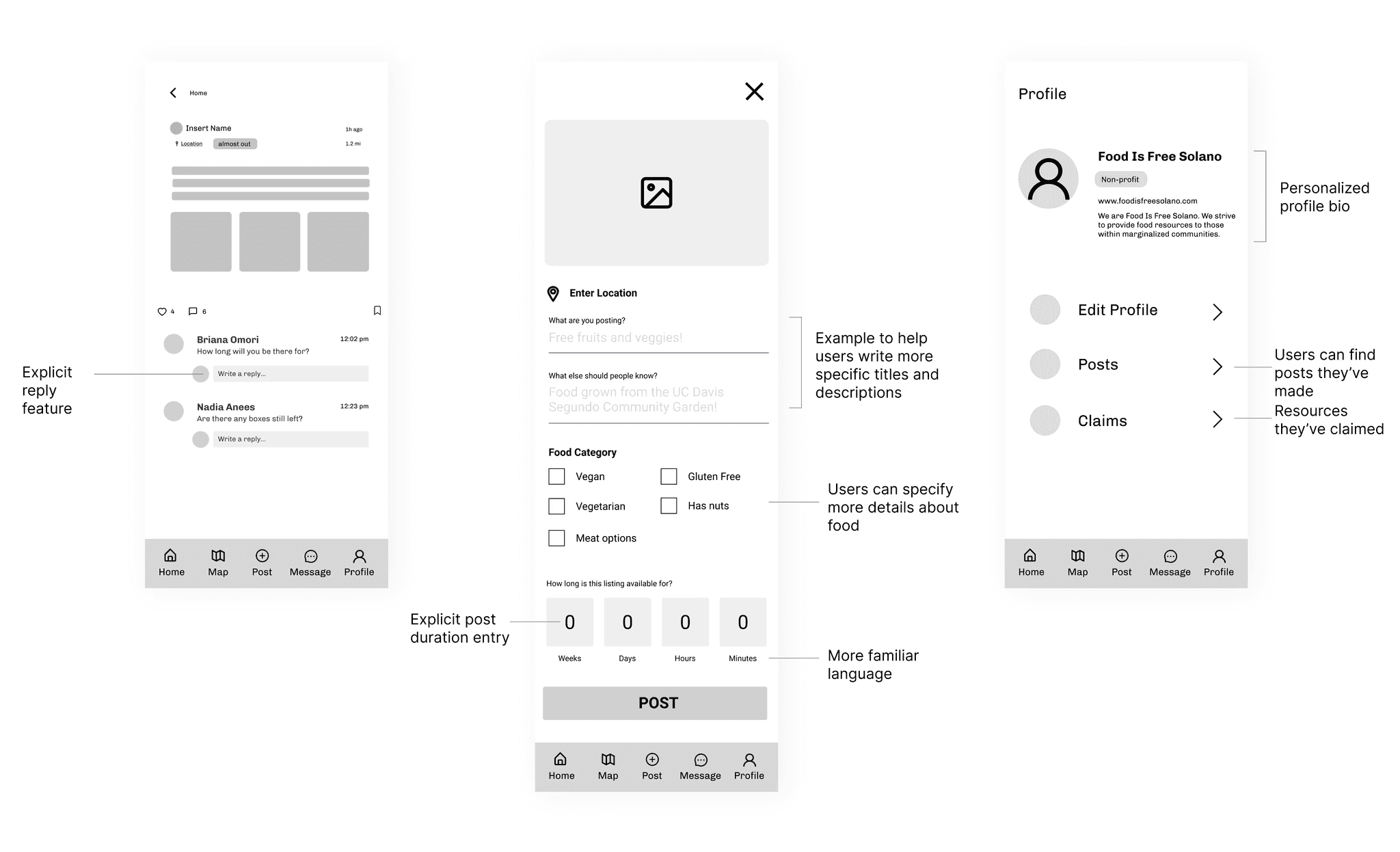
Reply to a comment
Users can quickly reply to a comment by typing into the pre-set "Write a reply" bubble.

Create a Post
Users can create a post and customize it to make for more accurate search results. We added many options to help avoid having users manually type in any specific details.

Edit a Post
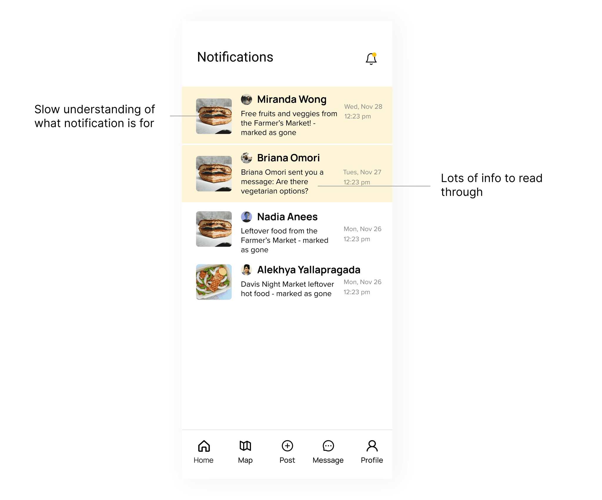
Users can update the status of their food surplus by editing a post. Once it's been edited, food seekers that have saved the post will be notified of its availability status change.

Send a Message
Users can quickly message other users about food acquisition details or ask any questions.

My Learnings
There truly are no dumb questions in research.
Naturally, I'm hesitant to ask questions, especially as this was my first deep-dive research case study. However, throughout this process I've realized that that poses a huge blocker that really had no business being there in the first place. I wanted to ask more questions to get at the heart of our problem space and use that as our north star. By asking questions during user interviews pertaining to how a user currently uses the app and what their goals are, it revealed that there were 3 different user types (something that wasn't obvious from the survey responses) and this key finding guided our entire problem-solving process. Because we wanted to create a holistic experience, it was so integral to understand each user type and their difficulties. I'm realizing as I take on more and more projects, expecting myself to know everything is an unrealistic feat and asking questions can really only help me in the process.
Asking questions helped me deliver a product that considered all users and their unique set of needs and ultimately gave the end-user complete control over how they use the app to accomplish their goals. I am incredibly excited for these designs to be developed and it's rewarding to know that I've contributed to the mission of alleviating food insecurity and cultivating a safe and giving community.